Position property
https://medium.com/@jacobgreenaway12/taming-the-css-beast-master-positioning-5882bad14458
An important concept to understand first is that every single element on a web page is a block. Literally a rectangle of pixels. This is easy to understand when you set the element to
An important concept to understand first is that every single element on a web page is a block. Literally a rectangle of pixels. This is easy to understand when you set the element to
display: block; or if that element is by default display: block; This means you can set a width and a height and that element will respect that. But elements that are display: inline;, like a
Now that you are picturing every single page element as a block of pixels, we can talk about how positioning is used to get the blocks of pixels exactly where you want them to go. We're going to leave off any discussion of the box model, but that factors into this as well...
- Static. This is the default for every single page element. Different elements don't have different default values for positioning, they all start out as static. Static doesn't mean much; it just means that the element will flow into the page as it normally would. The only reason you would ever set an element to
position: static;is to forcefully remove some positioning that got applied to an element outside of your control. This is fairly rare, as positioning doesn't cascade. - Relative. This type of positioning is probably the most confusing and misused. What it really means is "relative to itself". If you set
position: relative;on an element but no other positioning attributes (top, left, bottom or right), it will no effect on it's positioning at all, it will be exactly as it would be if you left it as position: static; But if you do give it some other positioning attribute, say,top: 10px;, it will shift its position 10 pixels down from where it would normallybe. I'm sure you can imagine, the ability to shift an element around based on its regular position is pretty useful. I find myself using this to line up form elements many times that have a tendency to not want to line up how I want them to.There are two other things that happen when you set position: relative; on an element that you should be aware of. One is that it introduces the ability to use z-index on that element, which doesn't really work with statically positioned elements. Even if you don't set a z-index value, this element will now appear on top of any other statically positioned element. You can't fight it by setting a higher z-index value on a statically positioned element. The other thing that happens is it limits the scope of absolutely positioned child elements. Any element that is a child of the relatively positioned element can be absolutely positioned within that block. This brings up some powerful opportunities which I talk about here. - Absolute. This is a very powerful type of positioning that allows you to literally place any page element exactly where you want it. You use the positioning attributes top, left, bottom. and right to set the location. Remember that these values will be relative to the next parent element with relative (or absolute) positioning. If there is no such parent, it will default all the way back up to the <html> element itself meaning it will be placed relatively to the page itself.The trade-off (and most important thing to remember) about absolute positioning is that these elements are removed from the flow of elements on the page. An element with this type of positioning is not affected by other elements and it doesn't affect other elements. This is a serious thing to consider every time you use absolute positioning. Its overuse or improper use can limit the flexibility of your site.
- Fixed. This type of positioning is fairly rare but certainly has its uses. A fixed position element is positioned relative to the viewport, or the browser window itself. The viewport doesn't change when the window is scrolled, so a fixed positioned element will stay right where it is when the page is scrolled, creating an effect a bit like the old school "frames" days.
Take a look at this site.(update: dead link, sorry), where the left sidebar is fixed. This site is a perfect example for since it exhibits both good and bad traits of fixed positioning. The good is that it keeps the navigation present at all times on the page and it creates an interesting effect on the page. The bad is that there are some usability concerns. On my smallish laptop, the content in the sidebar is cut off and there is no way from me to scroll down to see the rest of that content. Also if I scroll all the way down to the footer, it overlaps the footer content not allowing me to see all of that. It's a cool effect, and can be useful, but needs to be thoroughly tested. - Sticky
position: sticky can be explained as a mix of position: relative and position: fixed.
It behaves until a declared point like
position: relative, after that it changes its behavior to position: fixed . The best way to explain position: sticky is by an example:CSS selectors
A CSS selector is the part of a CSS rule set that actually selects the content you want to style. Let’s look at all the different kinds of selectors available, with a brief description of each.
- Simple selectors
- Universal selectors(*)
- Element type selectors(div)
- ID selectors(#id)
- Class selectors(.class)
- Attribute selectors(input[type="text"])
- Combinators
- Descendant combinator(div p)
- Child combinator(div > p): immediate child of div
- General sibling combinator(~)
- Adjacent sibling combinator (+)
- Column combinator (||)
- Pseudo classes
- Pseudo elements
Universal Selector
The universal selector works like a wild card character, selecting all elements on a page. Every HTML page is built on content placed within HTML tags. Each set of tags represents an element on the page. Look at the following CSS example, which uses the universal selector:
* {


   color: green;


   font-size: 20px;


   line-height: 25px;
}
The three lines of code inside the curly braces (
color, font-size, and line-height) will apply to all elements on the HTML page. As seen here, the universal selector is declared using an asterisk. You can also use the universal selector in combination with other selectors.Element Type Selector
Also referred to simply as a “type selector,” this selector must match one or more HTML elements of the same name. Thus, a selector of nav would match all HTML
nav elements, and a selector of <ul> would match all HTML unordered lists, or <ul> elements.
The following example uses an element type selector to match all
<ul> elements:ul {
list-style: none;
border: solid 1px #ccc;
}
To put this in some context, here’s a section of HTML to which we’ll apply the above CSS:
<ul>


  <li>Fish</li>


  <li>Apples</li>


  <li>Cheese</li>


</ul>


<div class="example">


  <p>Example paragraph text.</p>


</div>


<ul>


  <li>Water</li>


  <li>Juice</li>


  <li>Maple Syrup</li>


</ul>
There are three main elements making up this part of the page: Two
<ul> elements and a <div>. The CSS will apply only to the two <ul> elements, and not to the <div>. Were we to change the element type selector to use <div> instead of <ul>, then the styles would apply to the <div> and not to the two <ul> elements.
Also note that the styles will not apply to the elements inside the
<ul> or <div>elements. That being said, some of the styles may be inherited by those inner elements.ID Selector
An ID selector is declared using a hash, or pound symbol (
#) preceding a string of characters. The string of characters is defined by the developer. This selector matches any HTML element that has an ID attribute with the same value as that of the selector, but minus the hash symbol.
Here’s an example:
#container {


|
   width: 960px;


   margin: 0 auto;
}
This CSS uses an ID selector to match an HTML element such as:
<div id="container"></div>
In this case, the fact that this is a
<div> element doesn’t matter—it could be any kind of HTML element. As long as it has an ID attribute with a value of container, the styles will apply.
An ID element on a web page should be unique. That is, there should only be a single element on any given page with an ID of
container. This makes the ID selector quite inflexible, because the styles used in the ID selector rule set can be used only once per page.
If there happens to be more than one element on the page with the same ID, the styles will still apply, but the HTML on such a page would be invalid from a technical standpoint, so you’ll want to avoid doing this.
In addition to the problems of inflexibility, ID selectors also have the problem of very high specificity.
Class Selector
The class selector is the most useful of all CSS selectors. It’s declared with a dot preceding a string of one or more characters. Just as is the case with an ID selector, this string of characters is defined by the developer. The class selector also matches all elements on the page that have their class attribute set to the same value as the class, minus the dot.
Take the following rule set:
.box {


   padding: 20px;


   margin: 10px;


   width: 240px;
}
These styles will apply to the following HTML element:
<div class="box"></div>
The same styles will also apply to any other HTML elements that have a class attribute with a value of
box. Having multiple elements on a single page with the same class attribute is beneficial, because it allows you to reuse styles, and avoid needless repetition. In addition to this, class selectors have very low specificity—again, more on this later.
Another reason the class selector is a valuable ally is that HTML allows multiple classes to be added to a single element. This is done by separating the classes in the HTML class attribute using spaces. Here’s an example:
<div class=”box box-more box-extended”></div>Descendant Combinator
The descendant selector or, more accurately, the descendant combinator lets you combine two or more selectors so you can be more specific in your selection method. For example:
#container .box {


   float: left;


   padding-bottom: 15px;
}
This declaration block will apply to all elements that have a class of box that are inside an element with an ID of
container. It’s worth noting that the .box element doesn’t have to be an immediate child: there could be another element wrapping .box, and the styles would still apply.
Look at the following HTML:
<div id="container">


  <div class="box"></div>


  <div class="box-2"></div>


</div>


<div class="box"></div>
If we apply the CSS in the previous example to this section of HTML, the only element that’ll be affected by those styles is the first
<div> element that has a class of box. The <div> element that has a class of box-2 won’t be affected by the styles. Similarly, the second <div> element with a class of box won’t be affected because it’s not inside an element with an ID of container.
You should be careful when using the descendant combinator in your CSS. This kind of selector, while making your CSS a little easier to read, can unnecessarily restrict your styles to a specific context—in this case, the styles are restricted to boxes inside of
#container—which can make your code inflexible.Child Combinator
A selector that uses the
child combinator is similar to a selector that uses a descendant combinator, except it only targets immediate child elements:#container > .box {
float: left;
padding-bottom: 15px;
}
This is the same code from the descendant combinator example, but instead of a space character, we’re using the greater-than symbol (or right angle bracket.)
In this example, the selector will match all elements that have a class of
box and that are immediate children of the #container element. That means, unlike the descendant combinator, there can’t be another element wrapping .box—it has to be a direct child element.
Here’s an HTML example:
<div id="container">


  <div class="box"></div>


  <div>


    <div class="box"></div>


  </div>


</div>
In this example, the CSS from the previous code example will apply only to the first
<div> element that has a class of box. As you can see, the second <div> element with a class of box is inside another <div> element. As a result, the styles will not apply to that element, even though it too has a class of box.
Again, selectors that use this combinator can be somewhat restricting, but they can come in handy—for example, when styling nested lists.
General Sibling Combinator
A selector that uses a general sibling combinator matches elements based on sibling relationships. That is to say, the selected elements are beside each other in the HTML.
h2 ~ p {


   margin-bottom: 20px;
}
This type of selector is declared using the tilde character (~). In this example, all paragraph elements (
<p>) will be styled with the specified rules, but only if they are siblings of <h2> elements. There could be other elements in between the <h2> and <p>, and the styles would still apply.
Let’s apply the CSS from above to the following HTML:
<h2>Title</h2>


<p>Paragraph example.</p>


<p>Paragraph example.</p>


<p>Paragraph example.</p>


<div class="box">


  <p>Paragraph example.</p>


</div>
In this example, the styles will apply only to the first three paragraph elements. The last paragraph element is not a sibling of the
<h2> element because it sits inside the <div> element.Adjacent Sibling Combinator
A selector that uses the adjacent sibling combinator uses the plus symbol (+), and is almost the same as the general sibling selector. The difference is that the targeted element must be an immediate sibling, not just a general sibling. Let’s see what the CSS code for this looks like:
p + p {


   text-indent: 1.5em;


   margin-bottom: 0;
}
This example will apply the specified styles only to paragraph elements that immediately follow other paragraph elements. This means the first paragraph element on a page would not receive these styles. Also, if another element appeared between two paragraphs, the second paragraph of the two wouldn’t have the styles applied.
So, if we apply this selector to the following HTML:
<h2>Title</h2>


<p>Paragraph example.</p>


<p>Paragraph example.</p>


<p>Paragraph example.</p>


<div class="box">


  <p>Paragraph example.</p>


  <p>Paragraph example.</p>


</div>
…the styles will apply only to the second, third, and fifth paragraphs in this section of HTML.
Attribute Selector
The attribute selector targets elements based on the presence and/or value of HTML attributes, and is declared using square brackets:
input[type="text"] {


   background-color: #444;


   width: 200px;
}
There should not be a space before the opening square bracket unless you intend to use it along with a descendant combinator. The above CSS would match the following element:
<input type="text">
But it wouldn’t match this one:
<input type="submit">
The attribute selector can also be declared using just the attribute itself, with no value, like this:
input[type] {


   background-color: #444;


   width: 200px;
}
This will match all input elements with an attribute of type, regardless of the value.
You can also use attribute selectors without specifying anything outside the square brackets (thus targeting based on the attribute alone, irrespective of the element). It’s also worth noting that, when using values, you have the option to include quotes (single or double,) or not.
Column combinator
Pseudo-class
A pseudo-class uses a colon character to identify a pseudo-state that an element might be in—for example, the state of being hovered, or the state of being activated. Let’s look at a common example:
a:hover {


   color: red;
}
In this case, the pseudo-class portion of the selector is the
:hover part. Here we’ve attached this pseudo-class to all anchor elements (color property for that element will change to red. This type of pseudo-class is a dynamic pseudo-class, because it occurs only in response to user interaction—in this case, the mouse moving over the targeted element.
It’s important to recognize that these types of selectors do not just select elements; they select elements that are in a particular state. For the purposes of this example, the state is the “hover” state.
:active:any-link :blank :checked:default:defined:dir() :disabled:empty:enabled:first:first-child:first-of-type:fullscreen :focus:focus-visible:has() :host:host():host-context() :hover:indeterminate:in-range:invalid:lang():last-child:last-of-type:left:link:matches():not():nth-child():nth-last-child():nth-last-of-type():nth-of-type():only-child:only-of-type:optional:out-of-range:placeholder-shown :read-only:read-write:required:right:root:scope:target:valid:visitedPseudo-element
Finally, CSS has a selector referred to as a pseudo-element and, used appropriately, it can be very useful. It's a keyword added to a selector that let's you style a specific part of the selected element(s). The only caveat is that this selector is quite different from the other examples we’ve considered. Let’s see a pseudo-element in context:
.container:before {


   content: "";


   display: block;


   width: 50px;


   height: 50px;


   background-color: #141414;
}
This example uses one kind of pseudo-element, the
:before pseudo-element. As the name suggests, this selector inserts an imaginary element into the page, inside the targeted element, before its contents.:before and :after
why to use these pseudo elements?
Well, by using pseudo element, you make it more semantic. You don't need to create empty element just for layout purposes.
The cons, I believe some legacy browsers(<=IE7) won't support it, but you can use polyfill for that.
Say if you have a site like SO which has multple answers on each page. If you want to add an image/icon after each answer you could have something like
answercell.post-text:after {
    content: url(images/disclaimer.gif);
}
that way you can update the entire site without having to change a single HTML/ASPX page
So it makes site wide updates easier.
Addtionally it would reduce the page size in (Kb) as you would require less HTML so the page would load faster.
If you're talking about
:before and :after: They're used as presentational elements for cases where adding more elements into the actual document would be mixing structure with appearance. A few cases I've seen:- Bullets in bulleted lists
- Quotes around
qelements - Stylish shadows
- Decorations and the beginning or end of text
::after is a pseudo element which allows you to insert content onto a page from CSS (without it needing to be in the HTML). While the end result is not actually in the DOM, it appears on the page as if it is, and would essentially be like this:
CSS:
div::after {
content: "hi";
}
HTML:
<div>
<!-- Rest of stuff inside the div -->
hi
</div>
::before is exactly the same only it inserts the content before any other content in the HTML instead of after. The only reasons to use one over the other are:- You want the generated content to come before the element content, positionally.
- The
::aftercontent is also "after" in source-order, so it will position on top of ::before if stacked on top of each other naturally.
The value for content can be:
- A string:
content: "a string";- special characters need to be specially encoded as a unicode entity. See the glyphs page. - An image: content: url(/path/to/image.jpg); - The image is inserted at it's exact dimensions and cannot be resized. Since things like gradients are actually images, a pseudo element can be a gradient.
- Nothing: content: ""; - Useful for clearfix and inserting images as background-images (set width and height, and can even resize with background-size).
- A counter:
content: counter(li);- Really useful for styling lists until :marker comes along.
Note that you cannot insert HTML (at least, that will be rendered as HTML).
content: "<h1>nope</h1>";#: vs ::
Every browser that supports the double colon (::) CSS3 syntax also supports just the (:) syntax, but IE 8 only supports the single-colon, so for now, it's recommended to just use the single-colon for best browser support.
:: is the newer format indented to distinguish pseudo content from pseudo selectors. If you don't need IE 8 support, feel free to use the double-colon.
By definition :before and :after are CSS pseudo elements. You can use them to insert something before or after the content of an element. There are some great articles giving the basics, but I wanted to write down a blog post for the real use cases. Or, at least, to show what I'm using them for.
Syntax
Let's say that we have the following simple html markup:
<p>paragraph text</p>
We are able to use a pseudo element like that:
p:before {
    content: "this is ";
    font-weight: bold;
    font-style: italic;
}
And the result is:

Have in mind that you are actually adding an element before or after the content. It's not something which appear next to the selected element, but it is related to its content.
Icons
It is very popular to use :before or :after for displaying an icon. Because you are able to add every CSS style property, you could make the newly created element a block one and attach background image.
Again, we have the same markup
paragraph text
and the following CSS:
p:before {
    content: "";
    display: block;
    background: url("icon.jpg") no-repeat;
    width: 20px;
    height: 20px;
    float: left;
    margin: 0 6px 0 0;
}
icon.jpg is a 20x20 image exported from Photoshop. Here is how this looks in a browser:

Styling external links
I saw this in a good amount of products. It is a good practice to style differently the links which point to external resources. This could be easily done with the technique above. Let's say we have the following paragraph of text:
<p>Krasimir Tsonev is <a href="http://krasimirtsonev.com">developer</a>
who likes to write and <a href="https://twitter.com/KrasimirTsonev">tweet</a>.</p>
We could add a small icon after that link indicating that it points to page outside the current domain.
a {
    text-decoration: none;
    font-weight: bold;
    color: #000;
}
a:after {
    content: "";
    display: inline-block;
    background: url("icon-external.jpg") no-repeat top right;
    width: 14px;
    height: 12px;
}

Breadcrumbs (navigation)
Usually when you do breadcrumbs you have links and separator between them. Instead of adding an element into the DOM you could achieve the same effect with pure css.
The HTML:
<p>
    <a href="#">Home</a>
    <a href="#">Team</a>
    <a href="#">Developers</a>
</p>
Just a few lines of CSS:
a {
    text-decoration: none;
    font-weight: bold;
    color: #000;
}
a:after {
    content: " /";
}
a:first-child:before {
    content: " » ";
}
a:last-child:after {
    content: "";
}
And the result is this:

There are few interesting things happening. Firstly, there is a bullet before all the links. I combined two pseudo elements first-child and before saying "Add » before the first link". At the end I did the same thing to remove the separator from the last link in the list.
I found this extremely helpful. Mainly because I don't have to take care about this in the code which generates the navigation. I mean if I have to build the same thing with PHP I should write some additional code. For example:
$links = array('Home', 'Team', 'Developers');
$str = '» ';
for($i=0; $i<count($links); $i++) {
    $str .= '<a href="#">'.$links[$i].'</a>';
    if($i < count($links)-1) {
        $str .= ' / ';
    }
}
echo $str;
I.e. in the code above I added the bullet in front of the links and some logic for the separators inside PHP. That's somehow wrong, because the PHP code should not be responsible for the look of the things.
Clearing floats
Using float property is still quite popular. It helps a lot for layout organization. However, once an element is floated you need another element to clear the float. Otherwise the result is not so good. For example the following code:
* html
<a href="#">Home</a>
<a href="#">Products</a>
<p>Lorem ipsum dolor sit amet, consectetur adipiscing elit. Donec at purus ac lacus ultrices vehicula.</p>

* css
a {
    float: left;
    display: block;
    width: 100px;
    ... other styling
}
Will produce the following layout:

The text should be below the links and instead of adding new DOM node you can use :before pseudo element to clear the float:
p:before {
    content: "";
    display: block;
    clear: both;
}

Quoting
:before and :after are perfect for quoting text. Let's say that we have a smart thought and we want to format it.
<p>
    Martin Fowler said
    <span class="quoted">Any fool can write code that a computer can understand.
    Good programmers write code that humans can understand.</span>
</p>
The following effect could be achieved only with CSS:

span.quoted {
    font-family: Georgia;
    font-size: 16px;
    display: block;
    margin: 14px 0 0 0;
    font-style: italic;
}
span.quoted:before {
    content: "“";
    font-size: 40px;
    color: #999;
    line-height: 0;
    display: inline-block;
    margin: 0 6px 0 0;
}
span.quoted:after {
    content: " ”";
    font-size: 40px;
    color: #999;
    line-height: 0;
    display: inline-block;
    margin: 0 0 0 4px;
}
Arrows
You know those little things which the designers add to the popups or the nicely looking tooltips. It's kinda tricky to code them. Luckily you are able to solve the problem in your CSS file. No additional images or hacky JavaScript. Here is what I'm talking about.
As a starting point our markup looks like that:
<h2>What is CSS?</h2>
<div class="popup">
    Cascading Style Sheets is a style sheet language used for describing
    the presentation semantics of a document written in a markup language.
</div>
So, we have a title on the left and popup on the right. We need to add this little arrow on the left side of the description text, pointing to the title. Chris Coyier explainshow to make an arrow with simply border styling. We can use that and append such an element to our popup.
h2 {
    float: left;
    width: 170px;
}
.popup {
    float: left;
    width: 340px;
    background: #727272;
    padding: 10px;
    border-radius: 6px;
    color: #FFF;
    position: relative;
    font-size: 12px;
    line-height: 20px;
}
.popup:before {
    content: "";
    display: block;
    width: 0;
    height: 0;
    border-top: 12px solid transparent;
    border-bottom: 12px solid transparent;
    border-right: 12px solid #727272;
    position: absolute;
    top: 16px;
    left: -12px;
}
Styling titles
Currently I'm working on a project which is an one-page site. There are titles which devide the different sections. Every title is wrapped by two lines. Here is how the final design looks like:

Again really simple usage of :before and :after:
h2 {
    width: 100%;
    margin: 0;
    padding: 0;
    text-align: center;
}
h2:after {
    display: inline-block;
    margin: 0 0 8px 20px;
    height: 3px;
    content: " ";
    text-shadow: none;
    background-color: #999;
    width: 140px;
}
h2:before {
    display: inline-block;
    margin: 0 20px 8px 0;
    height: 3px;
    content: " ";
    text-shadow: none;
    background-color: #999;
    width: 140px;
}
Conclusion
The most important benefit of pseudo :after and :before elements is that you are able style your HTML without to add new DOM nodes. I really like to read clean and semantic markup. CSS is the place for all the visual things and it is great that we have such an instrument.
Inline vs block vs inline-block
Inline elements:
- respect left & right margins and padding, but not top & bottom
- cannot have a width and height set
- allow other elements to sit to their left and right.
- see very important side notes on this here.
Block elements:
- respect all of those
- force a line break after the block element
- acquires full-width if width not defined
Inline-block elements:
- allow other elements to sit to their left and right
- respect top & bottom margins and padding
- respect height and width
From W3Schools:

Web browsers treat every element as a kind of box. However, CSS has two different types of boxes — block and inline.
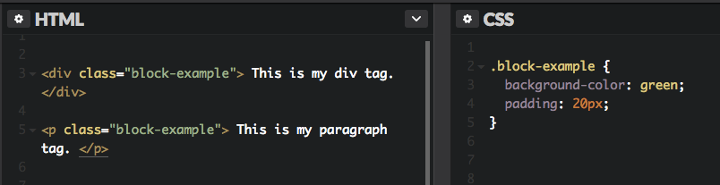
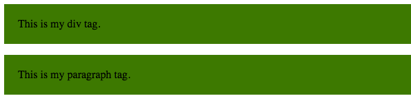
A block element always starts on a new line, and fills up the horizontal space left and right on the web page. You can add margins and padding on all four sides of any block element — top, right, left, and bottom.
Some examples of block elements are <div> and <p> tags. As shown below, I’ve also added green padding on all four sides of each block element.
Inline Elements
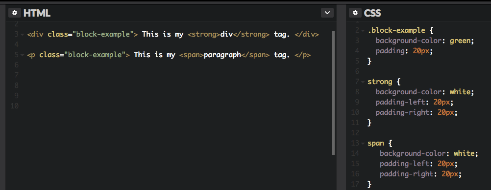
Inline elements don’t start on a new line, they appear on the same line as the content and tags beside them. Some examples of inline elements are <span> , <strong>, and <img> tags.
When it comes to margins and padding, browsers treat inline elements differently. You can add space to the left and right on an inline element, but you cannot add height to the top or bottom padding or margin of an inline element.
Inline elements can actually appear within block elements, as shown below. I’ve added white padding on the left and right side of each inline element.
Inline-Block
Inline-block elements are similar to inline elements, except they can have padding and margins added on all four sides. You’ll have to declare display: inline-block in your CSS code.
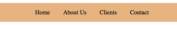
One common use for using inline-block is for creating navigation links horizontally, as shown below. I’ve created a horizontal navigation menu with an orange background color.
px vs em vs rem
Both
em and rem are flexible, scalable units which are translated by the browser into pixel values, depending on the font size settings in your design
On the other hand
px values are used by the browser as is, so 1px will always display as exactly 1px.
The difference between
em and rem units is how the browser determines the px value they translate into. Understanding this difference is the key to determining when to use each unit.
How rem Units Translate to Pixel Values
When using
rem units, the pixel size they translate to depends on the font size of the root element of the page, i.e. the html element. That root font size is multiplied by whatever number you’re using with your rem unit.
For example, with a root element font size of
16px, 10rem would equate to 160px, i.e. 10 x 16 = 160.

How em Units Translate to Pixel Values
When using
em units, the pixel value you end up with is a multiplication of the font size on the element being styled.
For example, if a div has a font size of
18px, 10em would equate to 180px, i.e. 10 x 18 = 180.

No comments:
Post a Comment